(диз) милтон
граф
Hello)
I’m Diana Grigoryan
aka. MILTON in social media.
But also passionate graphic designer.
I’m Diana Grigoryan
aka. MILTON in social media.
But also passionate graphic designer.
For about three years, I have been pursuing my bachelor's degree in Graphic Design and Visual Communications at a state university and taking on freelance projects
to enhance my skills. I`m an ex-lead designer at the IT-company АТИМ. Currently,
I`m completing my university studies and simultaneously undergoing
an internship at the typeface company Paratype.
My experience covers a wide range of graphic media creation, from brandbook assembly to font creation and accompanying production materials.
to enhance my skills. I`m an ex-lead designer at the IT-company АТИМ. Currently,
I`m completing my university studies and simultaneously undergoing
an internship at the typeface company Paratype.
My experience covers a wide range of graphic media creation, from brandbook assembly to font creation and accompanying production materials.

4
years in the design industry
2
participation in state projects
4
or more typographic projects
10
or more successful customer projects
EXPERIENCE
2022 — NOW
CASES
THE FONT "SOPLYA" /
ШРИФТ "СОПЛЯ"
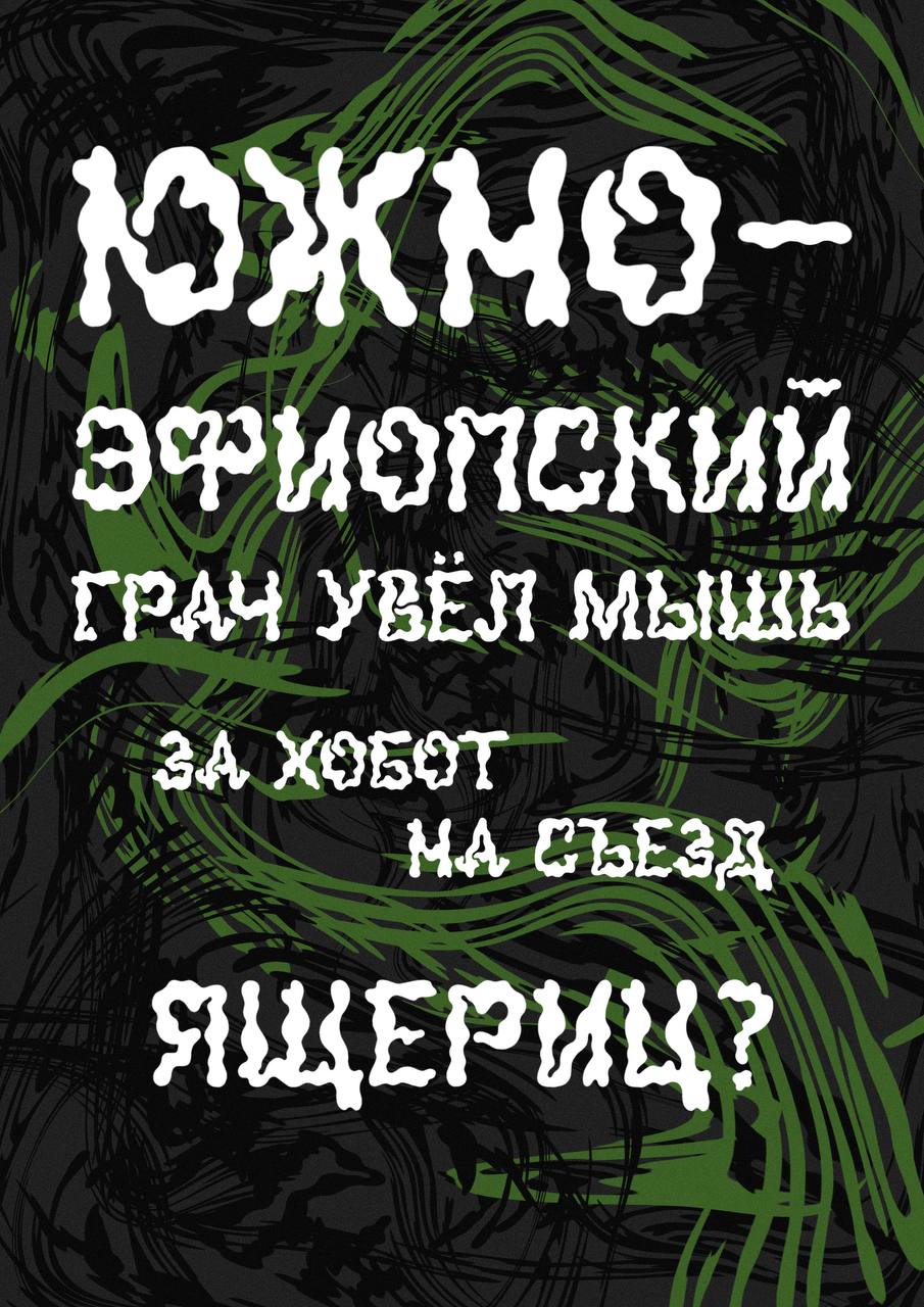
The project is a downloadable non-commercial author's font called "Soplya" (means the snot) with support for uppercase Cyrillic, numbers, and punctuation marks. It is an accented grotesque amorphous font
for decorative use in large sizes for displays, headings, and posters.
Here are some artistic graphic promotional materials for the created font —
pangrams that show all the letters at once and how harmonious their design is in the Russian interpretation.
ШРИФТ "СОПЛЯ"
The project is a downloadable non-commercial author's font called "Soplya" (means the snot) with support for uppercase Cyrillic, numbers, and punctuation marks. It is an accented grotesque amorphous font
for decorative use in large sizes for displays, headings, and posters.
Here are some artistic graphic promotional materials for the created font —
pangrams that show all the letters at once and how harmonious their design is in the Russian interpretation.
view more
DESIGN OF THE LSD GROUP'S VINYL ALBUM /
ДИЗАЙН ВИНИЛОВОГО АЛЬБОМА ГРУППЫ LSD
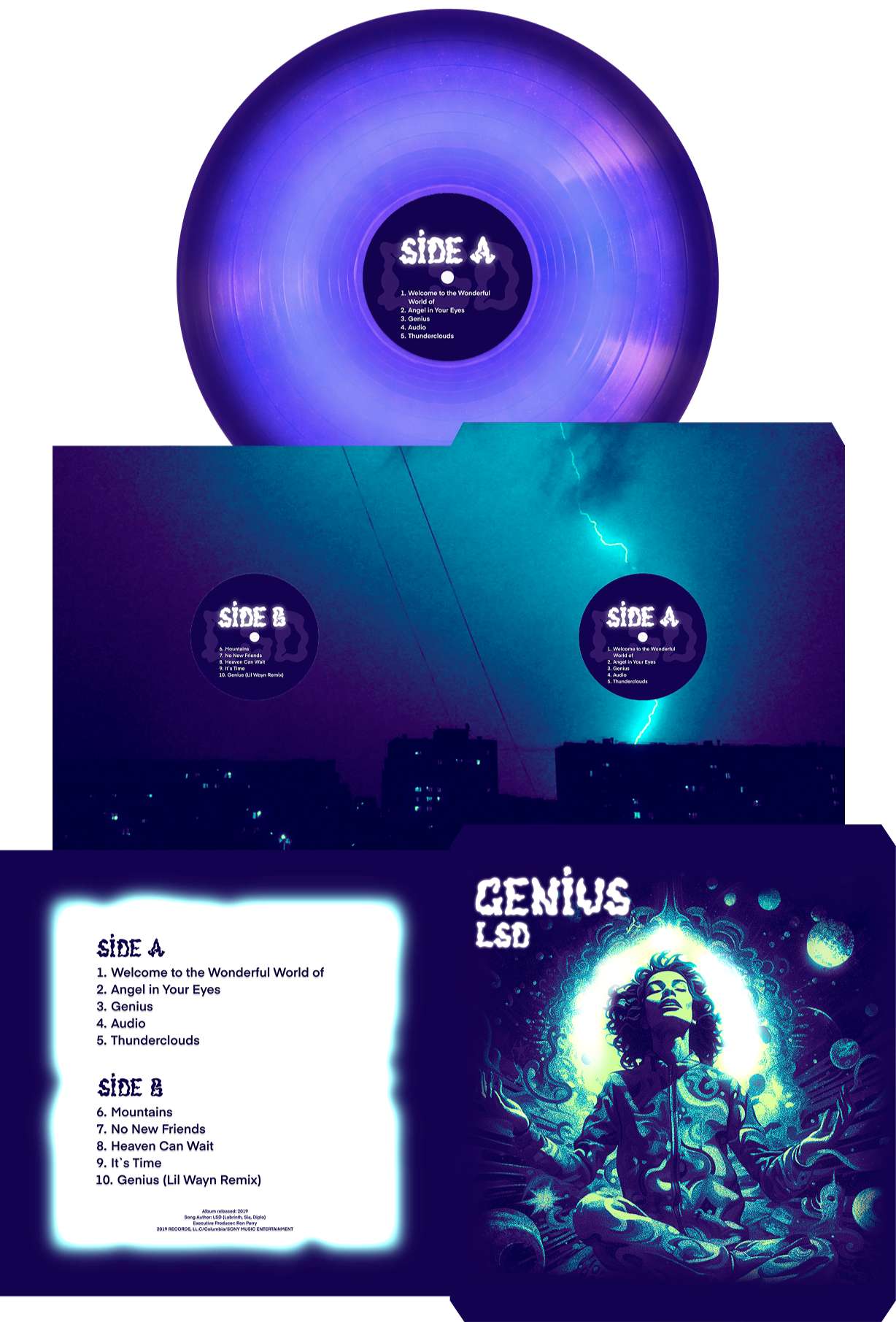
Design for the re-release of the only studio music album
on vinyl by the creative association LSD (Labrinth, Sia, Diplo)
with the author's font and the use of AI.
The generation is applied only on the outer envelope of the vinyl plate.
The design of the inner envelope is an author's photography.
ДИЗАЙН ВИНИЛОВОГО АЛЬБОМА ГРУППЫ LSD
Design for the re-release of the only studio music album
on vinyl by the creative association LSD (Labrinth, Sia, Diplo)
with the author's font and the use of AI.
The generation is applied only on the outer envelope of the vinyl plate.
The design of the inner envelope is an author's photography.
3D-MOTION LETTER "F" SERIES/
СЕРИЯ 3D-МОУШНОВ БУКВЫ "Ф"
This is a series created as part of the "Modern Typography" competition, which reimagines the visual and demonstrates the letter "F" of my choice.
All animations were created using 3d Max and subsequently edited
СЕРИЯ 3D-МОУШНОВ БУКВЫ "Ф"
This is a series created as part of the "Modern Typography" competition, which reimagines the visual and demonstrates the letter "F" of my choice.
All animations were created using 3d Max and subsequently edited
view more
SERIES OF KINETIC POSTERS "THE ERA OF TYPEFACES" /
СЕРИЯ КИНЕТИЧЕСКИХ ПЛАКАТОВ "ЭПОХИ ШРИФТОВ"
A series of motion posters using 5 main types of kinetic typography
in the visual and stylistic context of avant-garde and the dynamics of font evolution metamorphosis. The idea was to show that font modernization
is not a linear technical progress, but a series of aesthetic and philosophical judgments, each of which changed the overall perception.
СЕРИЯ КИНЕТИЧЕСКИХ ПЛАКАТОВ "ЭПОХИ ШРИФТОВ"
A series of motion posters using 5 main types of kinetic typography
in the visual and stylistic context of avant-garde and the dynamics of font evolution metamorphosis. The idea was to show that font modernization
is not a linear technical progress, but a series of aesthetic and philosophical judgments, each of which changed the overall perception.

available
10:00 - 20:00
